
We provide the easiest ticketing app for public transport. Every day we ask ourselves: what is the easiest ticketing app? We teamed up with the specialists at Telling, the Berlin-based design agency dedicated to mobility, to challenge our internal views. This concept study reflects our findings.
Four principles
Being on the move is a unique context for app use. Users only have a fraction of their attention available to look at a mobility app, unlike when they are on the couch.
Users are focused on getting where they need to go. They are juggling traffic lights, running to the train, bag in one hand, phone in the other, loudspeaker announcements on the platform: “Is this the right train?” Everything about this environment is distracting. It is this real-life situation that any design for mobility must address.
Of course, with our Smart Stop feature we take a large burden off the shoulders of our user, because the app automatically checks out. But there is more a design needs to address. By focusing on the following design principles, we cater for real life situations says Telling:
1. Glanceable
With only a fraction of the user’s attention, focus on showing them the relevant information at a glance.
2. Obvious
Make it crystal clear where to act in the interface. Avoid ambiguity.
3. Fast
Reduce the number of clicks users must make to complete their desired action.
4. Sticky
Create a design with character. It can help to identify a mobility app as such. And it sticks – users remember.

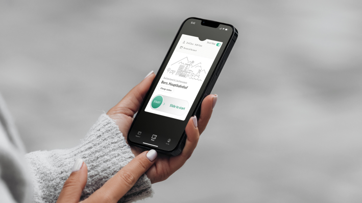
FAIRTIQ = Slide-to-Start
The FAIRTIQ brand is built around the slide-to-start message. There are good reasons not to use slide actions for the main action – they are kind of hard to discover –, but FAIRTIQ has one good reason to keep it: it sticks!
"Starting a journey with this lighthearted gesture matches the promise that accompanies every journey. During the ride, FAIRTIQ clearly indicates the status of the system. The entire area of the slide-to-start-element changes its color to green.”
– Lieke, Founder of Telling
Tab-Navigation
Tab-navigation shows all functionality at a glance. And provides quick access to important areas. It does not hide things like a hamburger menu. It makes it clear what is where. We see major players, who invest heavily in usability, moving away from the omnipresent hamburger navigation. Hooray! Google Maps dropped it in 2019, Uber removed it more recently, Spotify left it behind in 2016. Should FAIRTIQ ditch the hamburger too? What do you think?
 "A hamburger menu doesn't solve app navigation clutter. It just hides the problem. Discoverability suffers when the entire navigation interface is hidden behind a small icon."
- Frank, Craftsman at Telling
Paper ticket analogy
The paper ticket analogy provides character beyond the sliding action button. All relevant ticket information is visible at a glance. In the center of the screen, the main information is presented in a relevant hierarchy. Secondary ticket information is grouped at the top of the ticket. Before starting their journey users can now toggle the smart stop option without leaving the main screen. The toggle is also adequately labelled and colored for higher recognition. Once the user swipes to start a journey, the ticket flips over to display a QR code.
 "With the paper ticket metaphor, users immediately identify the app as a ticketing app. It also gives them confidence: They are really buying a ticket here! The ticket analogy combines a product that feels futuristic with an artefact that users can relate to."
- Kay, UX Designer at Telling
Conclusion
Taking the time to reflect on the relevant design principles together with the Telling team really helped us to challenge the status quo. Designing for mobility has its own challenges. We see ourselves in a good position to bring our public transport ticket experience to more users. It will be even faster, more glanceable, more obvious, and stickier than ever before. Stay tuned!
"Telling Studio really impressed us with their skilled understanding of apps for mobility. We fell in love with this concept study at first sight."
– Katerina Janaqi, UX Design at FAIRTIQ
"We are constantly growing and bringing FAIRTIQ to more people. This concept study shows that we are serious about public transport made easy ."
– Jonas Lutz, Chief Product & Marketing Officer of FAIRTIQ


.jpg?width=732&name=220907hallandstrafiken-buss7103%20(2).jpg)


Share